THE INTENTIONAL IMAGE
Steven Zaillian's Ripley is extraordinarily beautiful, but its greater achievement is something rarer: it has a point of view. In an age of coverage, here is a director willing to decide exactly what we should see — and what we should not.
There is a tendency, when discussing Ripley, to begin with its beauty. This is understandable. Steven Zaillian's adaptation of Patricia Highsmith's novel contains some of the most extraordinary images made for television in recent years. Robert Elswit's black-and-white cinematography turns staircases, hotel rooms, railway platforms and Italian streets into compositions that seem to have been considered with the patience of paintings. One could pause almost anywhere and spend time simply looking at the frame.
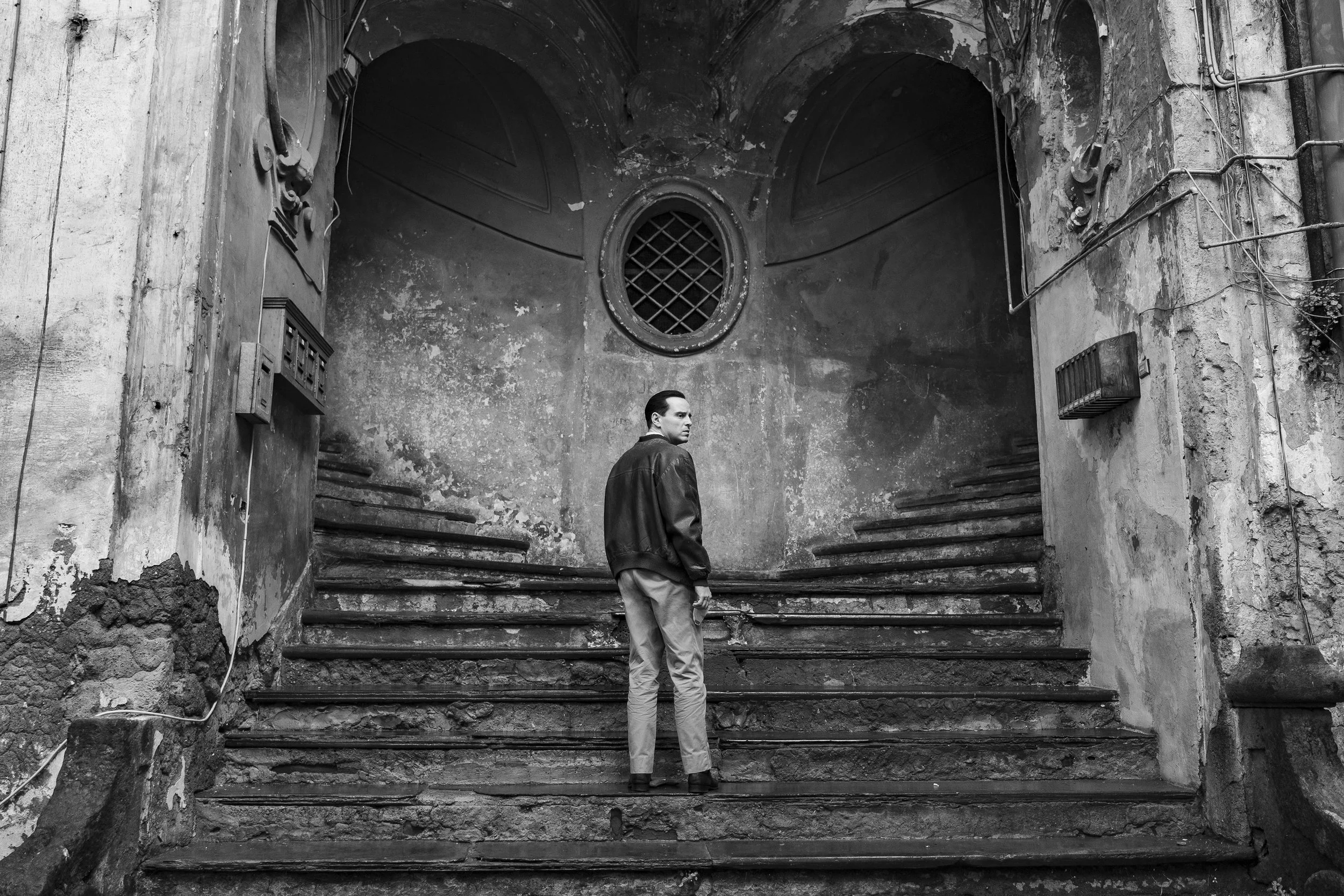
Yet beauty is not quite what makes Ripley remarkable. There are plenty of beautiful films and television programmes, particularly now that extraordinary cameras, lenses, locations and production design are available to productions of sufficient scale. What is much harder to find is something Ripley possesses from its first minutes: the unmistakable presence of a director.
You can feel Steven Zaillian making choices.
That sounds like the most elementary definition of directing, but it is worth considering how unusual the sensation has become. There are films and television series made with enormous skill that nevertheless seem to possess no particular visual authorship. The performances are good, the photography handsome, the production immaculate, yet one suspects another competent director could have made essentially the same thing. The scene has been captured from every necessary position — wide, medium, close, reverse, insert — and its final shape discovered later. Everything required is present. What is missing is a point of view.
Coverage is useful because it preserves possibility. A director who photographs a scene from several angles gives the editor choices. A performance can be tightened, a pause removed, a reaction inserted, an emphasis changed. It is one of the practical foundations upon which film and television are made.
But possibility has an artistic cost. If every option remains available, when does somebody actually make the choice?
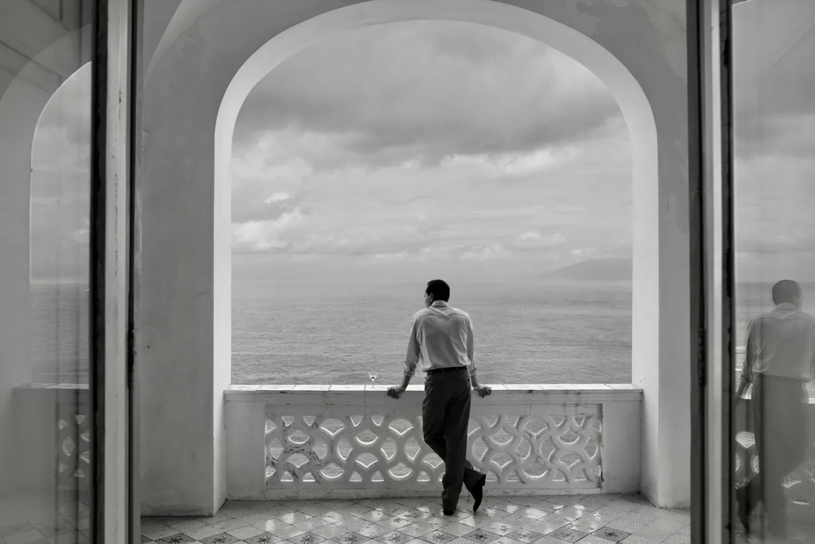
The great visual directors are often recognisable precisely because they eliminate possibilities. Hitchcock knew what the audience should see and when they should see it. Ozu repeatedly returned his camera to a particular height and position. Kubrick's compositions possess such geometric certainty that they could scarcely belong to anyone else. Antonioni allowed architecture and absence to occupy space another filmmaker might have filled with faces. These directors differed enormously, but each understood that style emerges as much from refusal as invention. They chose where the camera belonged and, crucially, where it did not.
Ripley has that same confidence.
Zaillian and Elswit do not appear to be collecting material from which a scene might later be constructed. The frame frequently feels like the scene. A character enters it, moves through it and leaves it while the camera remains where it was placed. At other moments Tom Ripley is positioned so far from us that another production would almost certainly have cut to his face. Zaillian doesn't. If Tom is meant to appear diminished by a building, then the building must remain enormous and Tom must remain small. A close-up would provide more information about Andrew Scott's performance, but it would destroy the idea contained in the composition.
This is what a directorial choice looks like.
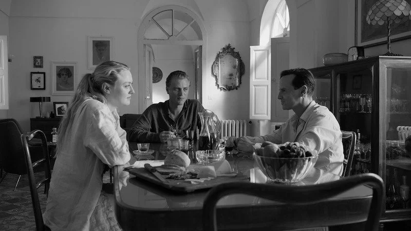
The same is true of the series' extraordinary use of architecture. Staircases are not merely convenient routes between locations. Doorways are not simply things actors walk through. Windows, arches, corridors, statues and façades are organised around the characters until the environment begins to participate in the drama. A figure placed at the bottom of a staircase means something different from a figure photographed at its summit. A man enclosed within a doorway is not the same image as that man isolated against an empty wall.
These distinctions are obvious in painting. Move a figure several inches across a canvas and the entire composition changes. Increase the darkness behind a face and the expression appears different. Change the proportion between a human body and the architecture surrounding it and you alter our understanding of that person's importance. Painters have always understood that meaning is produced not only by the subject, but by the precise arrangement of the subject within a rectangle.
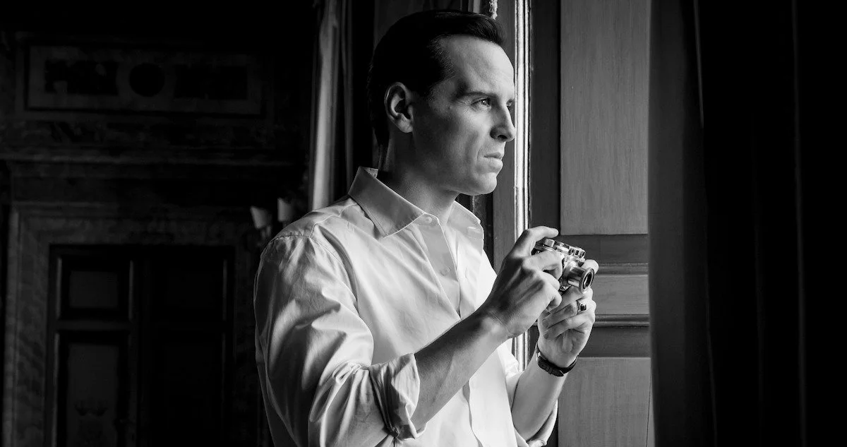
Zaillian directs Ripley with a similar awareness of the frame.
It is one reason individual images possess such unusual completeness. They do not look like fragments awaiting assembly. There is a visual thought contained within them.
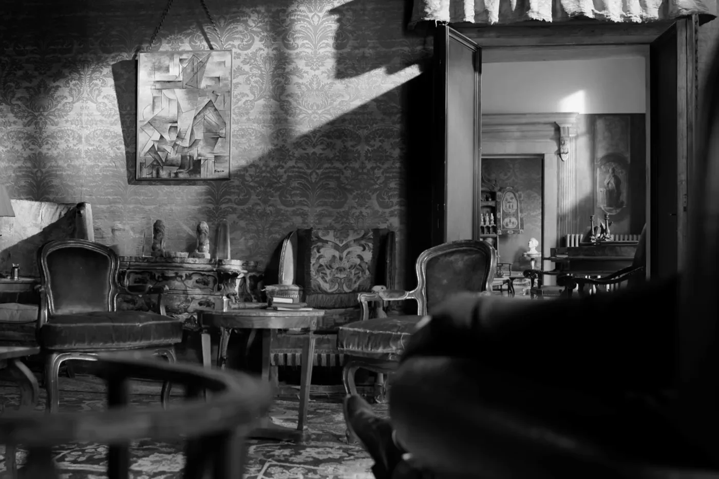
Tom Ripley is particularly suited to this kind of filmmaking because he is himself obsessed with looking. He arrives in Italy as an outsider studying a world he wants to enter. Dickie Greenleaf's clothes, house, paintings, money and manner are not simply things Tom envies; they are evidence. He observes how Dickie inhabits his life and begins, slowly, to reproduce it.
Zaillian places us in a similarly observational position. Rather than constantly bringing the camera closer to explain Tom to us, he frequently makes us search for him within the composition. Andrew Scott's performance is wonderfully restrained, but the direction refuses to translate every internal movement into a close-up. We watch him looking. We begin looking at him.
That distance creates something coverage often removes: ambiguity.
A close-up is an extraordinarily powerful filmmaking tool because it tells us where meaning resides. Here is the face; look at it. A cut to a reaction tells us that the reaction matters. A cutaway to an object tells us to remember the object. Used well, these are the grammar of cinema. Used automatically, they can begin to remove the pleasure of looking for ourselves.
Ripley trusts the audience to find things.
An object may remain somewhere within a wider frame rather than receiving its own shot. A statue seems to observe Tom without the camera insisting that we notice it. Mirrors and windows repeatedly divide the image, but nobody pauses to explain their significance. Visual motifs accumulate quietly until we become conscious of them.
The staircases are perhaps the most obvious example. Atrani is a town seemingly built from them, rising between buildings in extraordinary patterns. Zaillian has spoken of being reminded of M.C. Escher when he first encountered the location, before discovering that Escher had actually lived there and drawn it. In another production, those stairs might simply have provided an attractive Italian backdrop. Here they become part of the structure of the series.
Tom is forever climbing.
It would be easy to make the metaphor crude — the poor American ascending towards the privileged life he covets — but Zaillian rarely needs to underline it. He simply keeps returning to the image. The meaning grows through repetition.
The same discipline governs the decision to make Ripley in black and white. It is tempting to describe monochrome as a stylistic flourish, particularly when filming Italy, a country cinema has taught us to associate with terracotta, Mediterranean blue and blazing sunlight. But removing colour changes the information available within every composition. Stone becomes texture. Water becomes tone. Faces become arrangements of light and darkness. A white shirt against a black sea suddenly carries enormous visual weight.
Again, something has been surrendered in order to create something else.
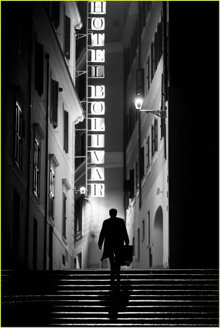
That principle runs through the entire series. Colour is surrendered. Camera movement is frequently surrendered. Close-ups are withheld. Shadows are allowed to conceal information. Shots continue beyond the point at which contemporary editing rhythms might encourage a cut. Architecture is permitted to overwhelm the actors.
Every limitation strengthens the identity of the whole.
This is where Robert Elswit's cinematography becomes so important. Zaillian's visual conception requires a cinematographer capable not merely of producing beautiful images but of understanding what those images are meant to accomplish. Their collaboration feels unusually complete. Elswit's light does not decorate Zaillian's compositions; it gives them structure.
Caravaggio is the obvious presence. Zaillian brings the painter explicitly into the story, but his influence extends far beyond the references made by the characters. Faces emerge from darkness. Light arrives from a definite direction rather than simply making everything visible. Black areas of the frame are allowed to remain black.
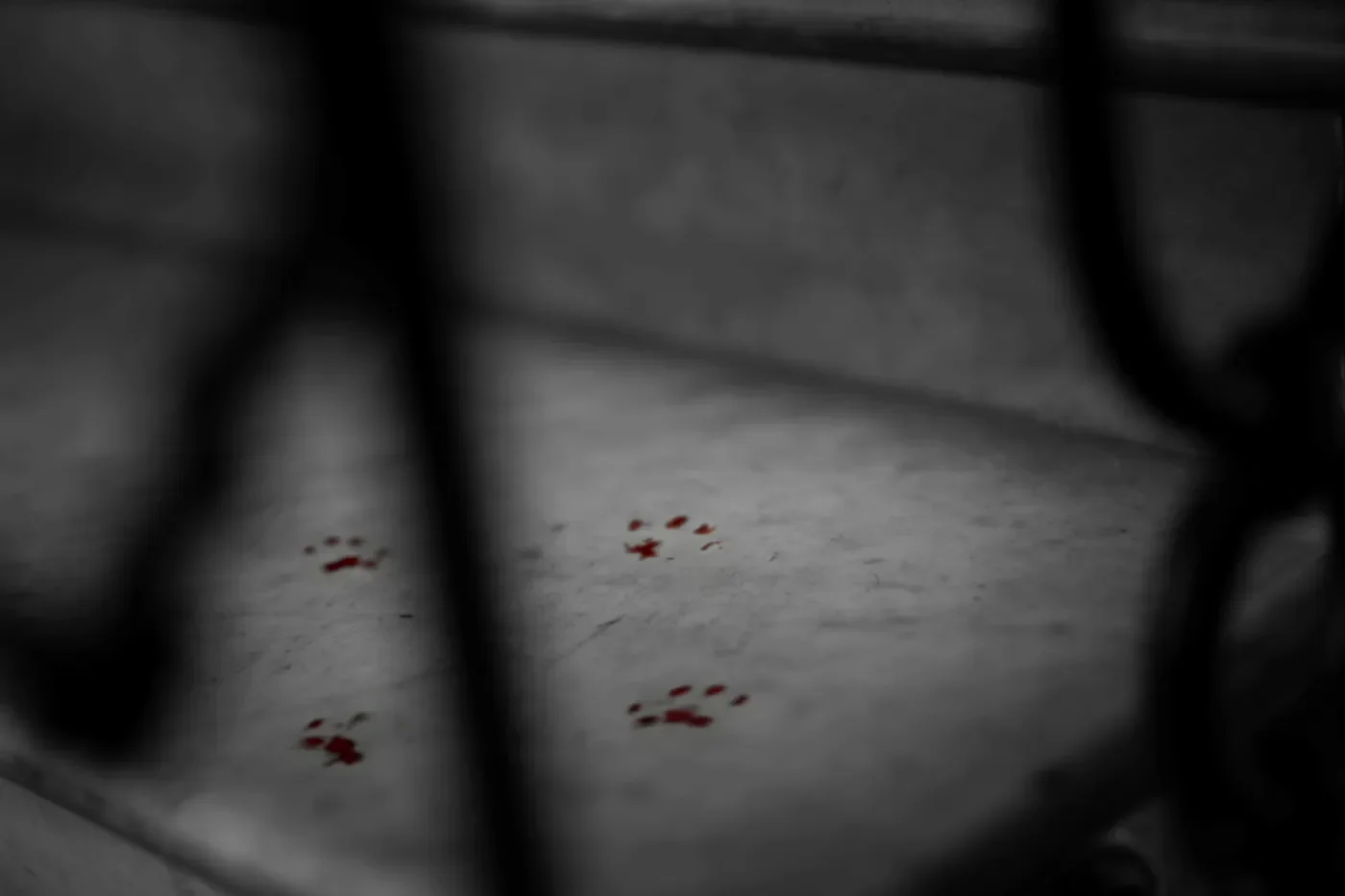
This may be one of Ripley's most beautiful refusals. Modern digital cameras can see astonishingly well in darkness, and there is a temptation to preserve all that information simply because it exists. Ripley understands that the ability to see something is not necessarily a reason to show it.
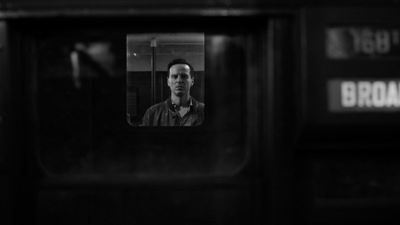
A painter knows this instinctively. Darkness is not empty. Negative space is not unused. What is absent from a composition gives form to what remains.
Perhaps this is the distinction between an image that is attractive and one that has been authored. The former asks whether something looks good. The latter asks why it should look this way and no other.
There is an illuminating comparison with Anthony Minghella's 1999 adaptation of The Talented Mr. Ripley. Minghella's film is itself exquisitely directed, but its visual conception is almost the inverse of Zaillian's. His Italy is sensuous, colourful and intoxicating. We understand Tom's obsession with Dickie's life because the film makes us want it too: the water, jazz, linen shirts, sun-baked towns and carelessness of inherited money.
Zaillian does not attempt to improve upon or imitate that vision. He makes another choice entirely.
His Italy is winter rather than summer, stone rather than sea, shadow rather than sunlight. Dickie's world remains desirable, but it is colder and more remote. Tom doesn't tumble helplessly into its pleasures; he studies them.
Two directors can therefore begin with the same novel, the same country and essentially the same characters and produce images belonging to entirely different imaginative worlds.
That is direction.
It is not merely managing performances, keeping a production moving or ensuring the screenplay has been photographed. It is deciding what the work believes visually.
One of the peculiarities of contemporary filmmaking is that technological possibility has never been greater while visual distinction can sometimes feel increasingly scarce. Cameras can go almost anywhere. Stabilisation allows movement that once required elaborate machinery. Digital sensors can photograph in extraordinary darkness. Multiple cameras can capture a performance simultaneously. Editors can reshape scenes with astonishing freedom.
All of this is useful. None of it guarantees style.
Style requires choosing.
A director must eventually say: this is where we look from.
Not everywhere. Here.
That choice can be wrong. It can make editing more difficult. It can deny a performance the safety of additional coverage. It requires confidence because once the camera has been placed deliberately, the director has committed to an interpretation of the scene.
But that commitment is precisely what gives an image identity.
It is why a frame from Kubrick does not resemble one from Cassavetes, why Fellini's Rome is not Antonioni's Rome, and why Zaillian's Italy could never be confused with Minghella's. These filmmakers are not merely photographing different things. They are looking differently.
Ripley is a reminder of how pleasurable it is to feel somebody looking.
Its beauty comes from Robert Elswit's extraordinary photography, from the Italian locations, from David Gropman's production design and from the faces and clothes placed before the camera. But behind all of those elements is an organising intelligence. Someone has decided what belongs in the rectangle, where it belongs, how long we will be permitted to look at it and what will remain outside.
Every frame feels like a painting because, like a painting, it begins with a series of choices.
Where does the figure stand? Where does the light fall? How much emptiness should surround them? What should dominate the composition? What should disappear into darkness? Where should the eye travel first, and what might it discover afterwards?
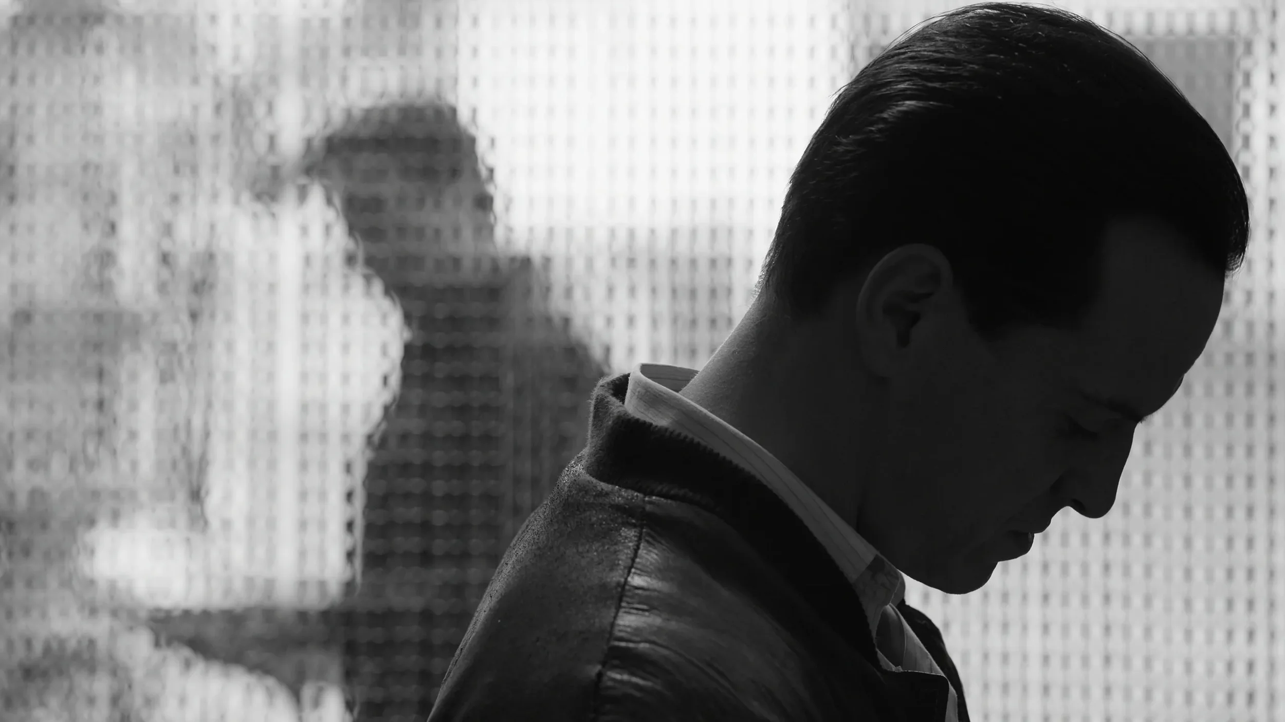
These are not questions of coverage. They are questions of authorship.
Perhaps that is why Ripley feels so different from much of what surrounds it. It does not simply have a look. It has a way of looking.
And you could never mistake it for the work of just anyone.